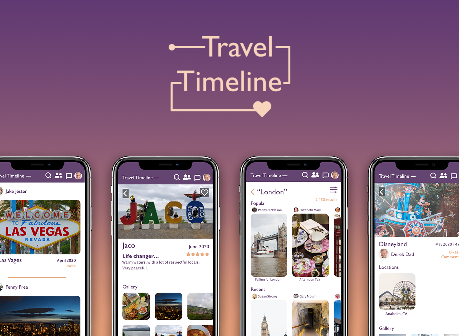
Purpose
Travel Timeline is a virtual traveling journal where people can share, comment, and archive any travel related events. Individuals can neatly organize and document photos related to their trips, locations they have stayed at, where they have eaten, and notable places or events they went to. Within these specific categories, people can even rate and talk about their personal experiences in as much detail as they like.
Problem
I participated in a Creative Jam with a partner that was hosted by Adobe XD and Airbnb. This was an opportunity to get more practice on Adobe XD from experts and to design an application. The prompt is to empower families and groups of friends who travel together a collaborative way to document, organize, and share thair travel experiences and stays to the larger Airbnb community.
My Role
UX Designer
Tools Used
Adobe XD
Duration
April 24 2020 - April 26 2020
There was worrying that all the content would be overwhelming so there was a need to quickly figure out how to efficiently layout the contents. Doing quick interations of the architecture wsas most helpful.
The two personas that were made up were purposely made very different from each other to show how wide the audience can be to use the application. There was also no top priority between the two personas.
When the user interacts with the application, they should feel relaxed when uploading their photos and talking about their trip. Almost like the user was doing a casual journal entry at the end of the day. The color palette is supposed to emulate a the colors that would be be part of a sunset.
Lessons
By the time I was partaking in this creative jam, I had very little design experience. However, taking on this creative jam with another individual to be completed in three days was challenge that was vital to practicing design. It was an opportunity to really utilize the skills I learned at very quick pace, really forcing me to make decisions on that spot that would still create a great quality application in the end.