Purpose
HuskyBank is your financial companion to prepare you for the “real world”. Starting college is already a hard transition to go through, being in debt makes it harder. HuskyBank presents students the opportunity to play with the idea of budgeting. As they play, students learn the tools they need to manage finances responsibly in a less-intimidating and interactive experience.
Problem
As university students try to manage their school work, jobs, and social lives, there is a tendency to forget how to properly manage their money. The financial stress accumulates and puts a greater mental strain on the students, negatively affecting the overall well-being of the students.
My Role
UX Researcher
Tools Used
Figma, Webstorm
Duration
September 2019 - March 2020
Competitive Analysis
Being unfamiliar on what makes an efficient and effective budgeting application I wanted to focus on the features that are most used, as well as the features that aren't seen as necessary. Looking through costumer reviews on the 6 most popular budgeting/finance related apps was a way to gain that insight.
App Inspirations
Pros
Cons
To understand what university students are experiencing regarding financial difficulties and budgeting app background, conducting interviews needed figure out the student's financial practice. The responses that were heavily analyzed was what the students look for in a budgeting app. The responses mainly focused on:
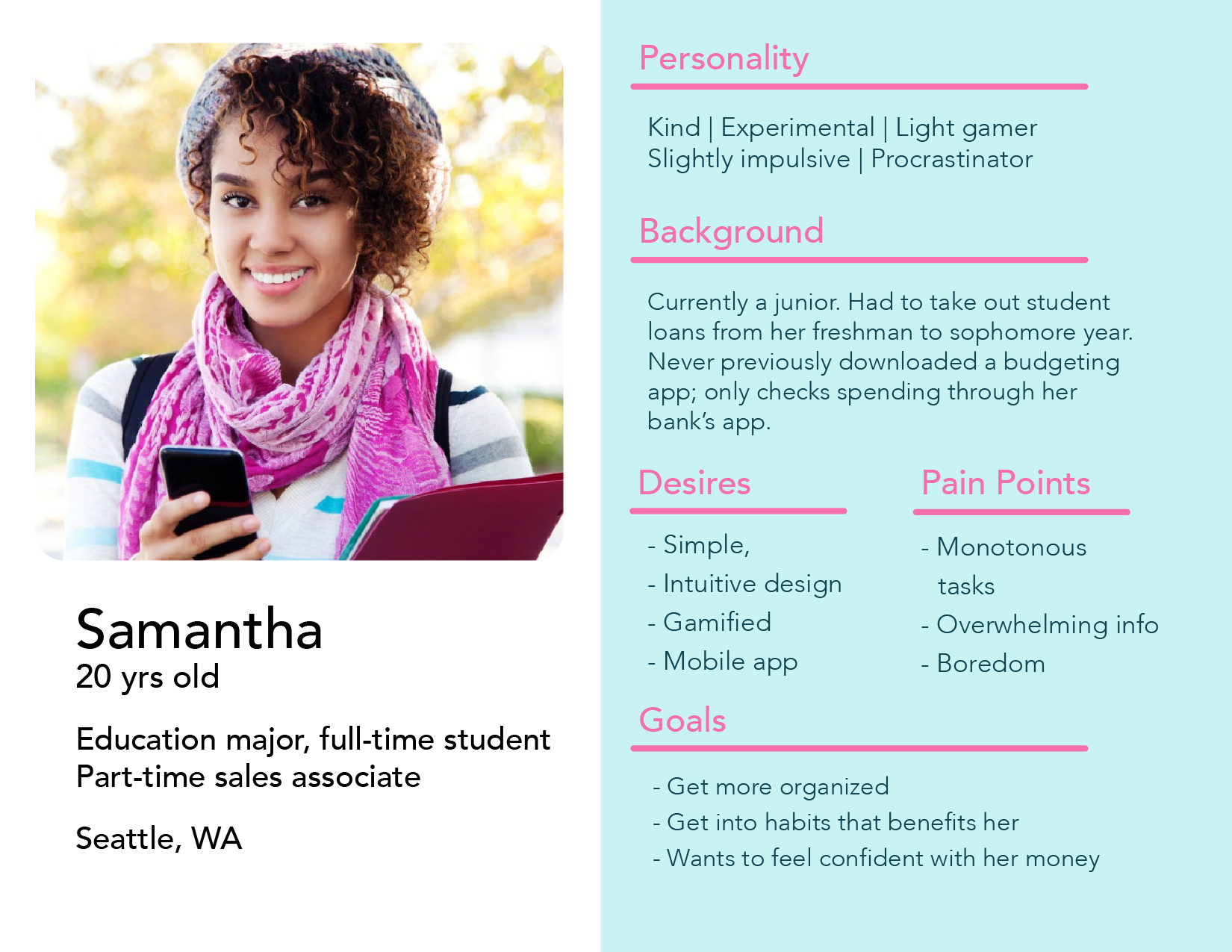
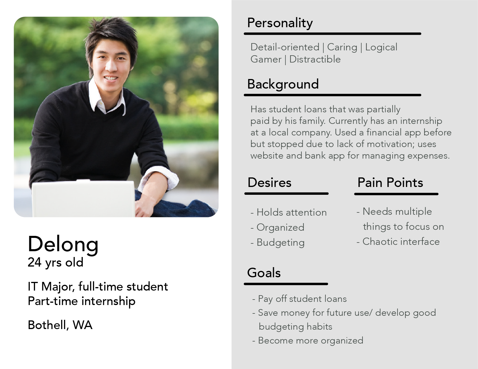
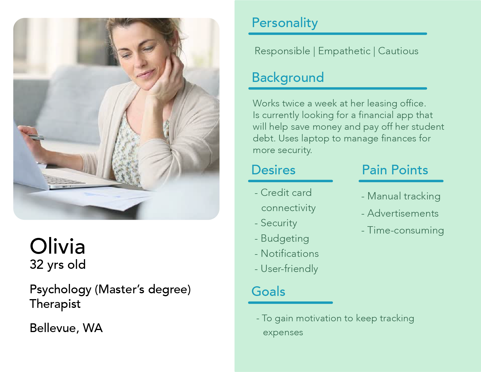
After examining the findings from the research, an outline was created to form who our audience was. The audience was split up into 3 main personas. The 3 personas ranged from our optimal target audience to our least targeted audience. I created our optimal target persona "Samantha" intending to describe her as the typical student who attends the University of Washington and is in a financial struggle with the hopes of getting more organized with her money.
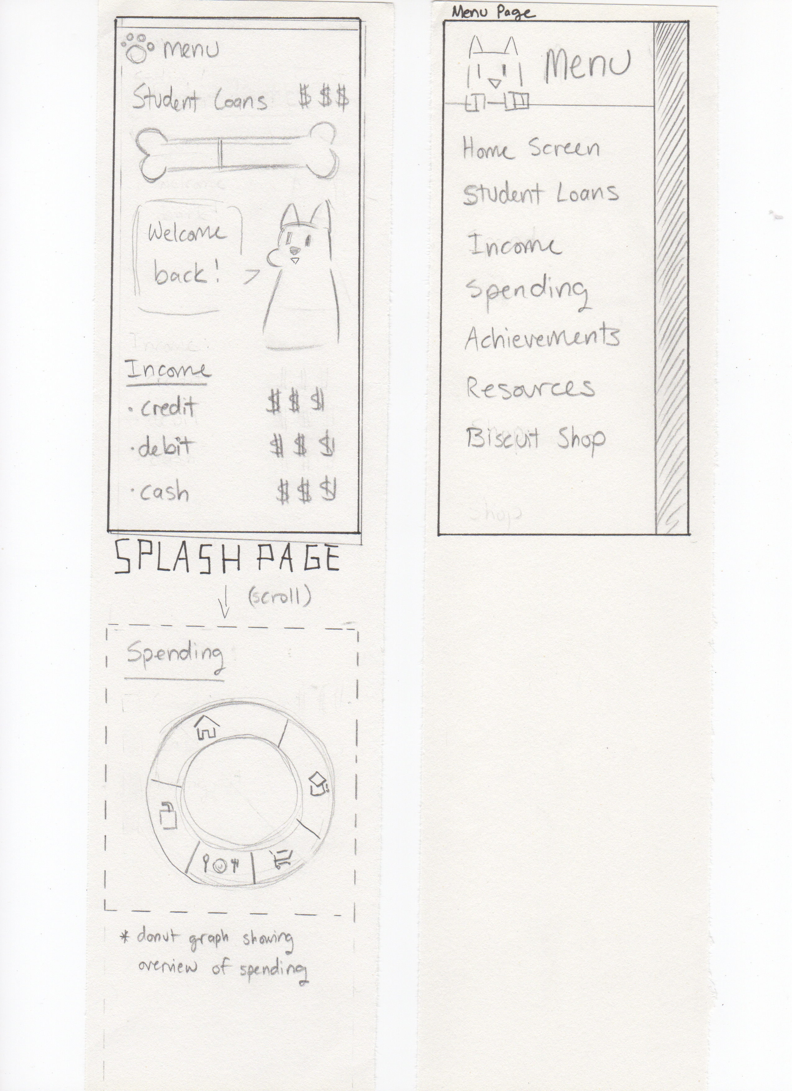
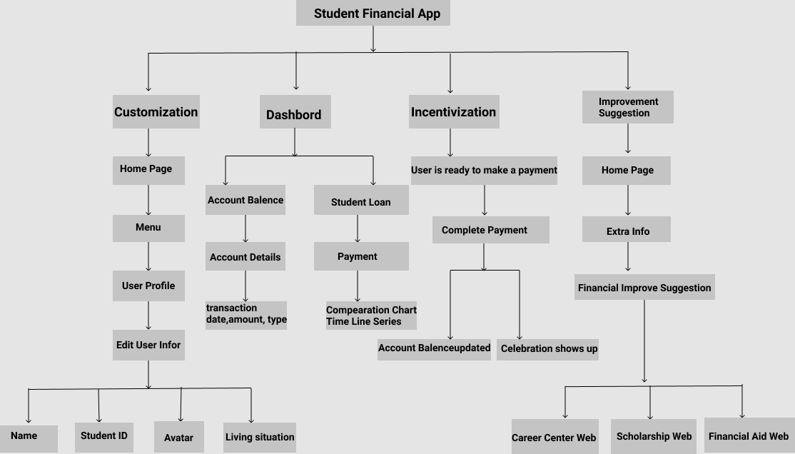
Once the contents are being developed, there is a question on how to structure the them to provide the most intuitive flow for the users. Creating an information architecture allowed a flexible method to test and re-organize the contents to end with one that will provide a seamless user experience.


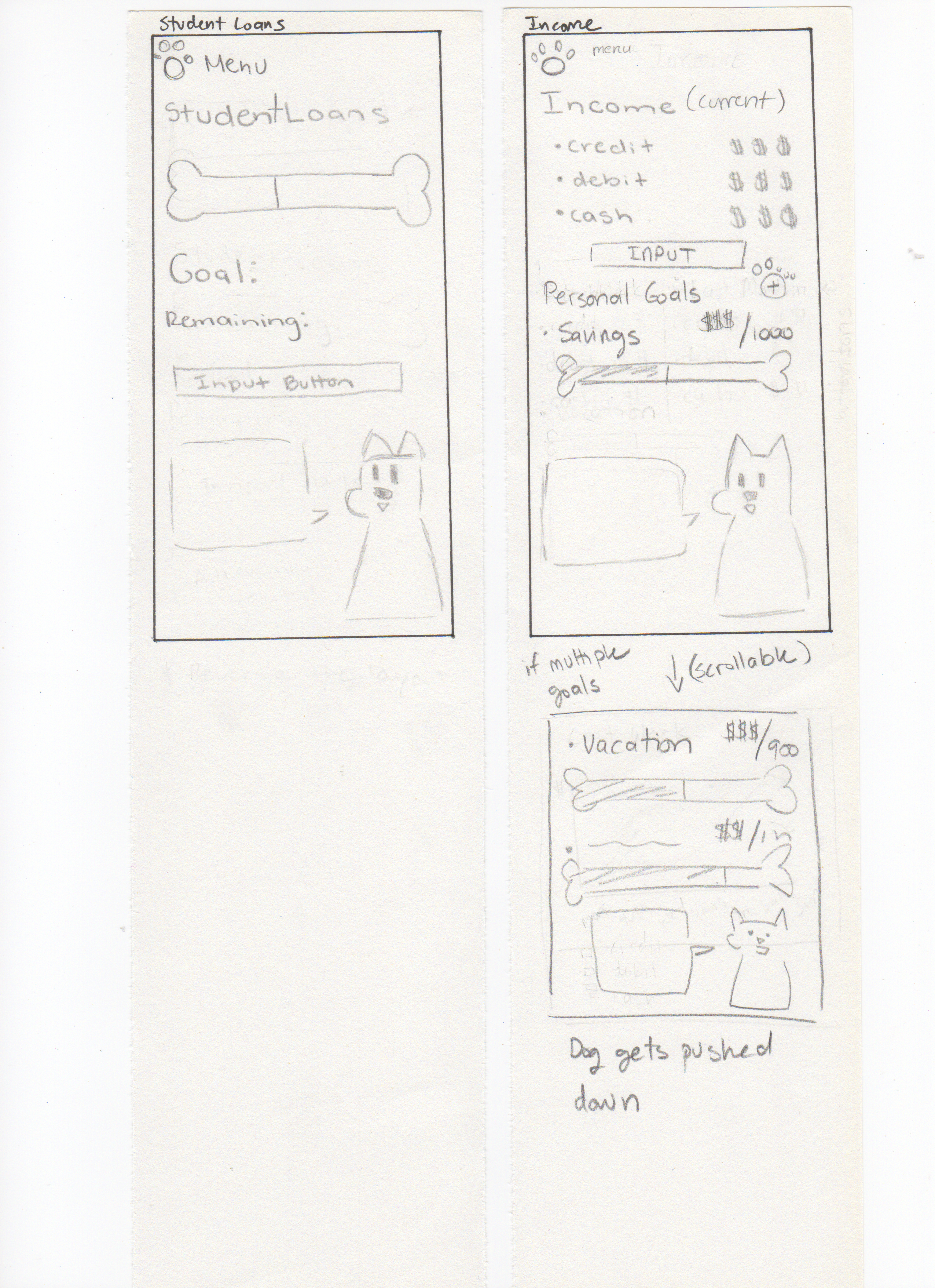
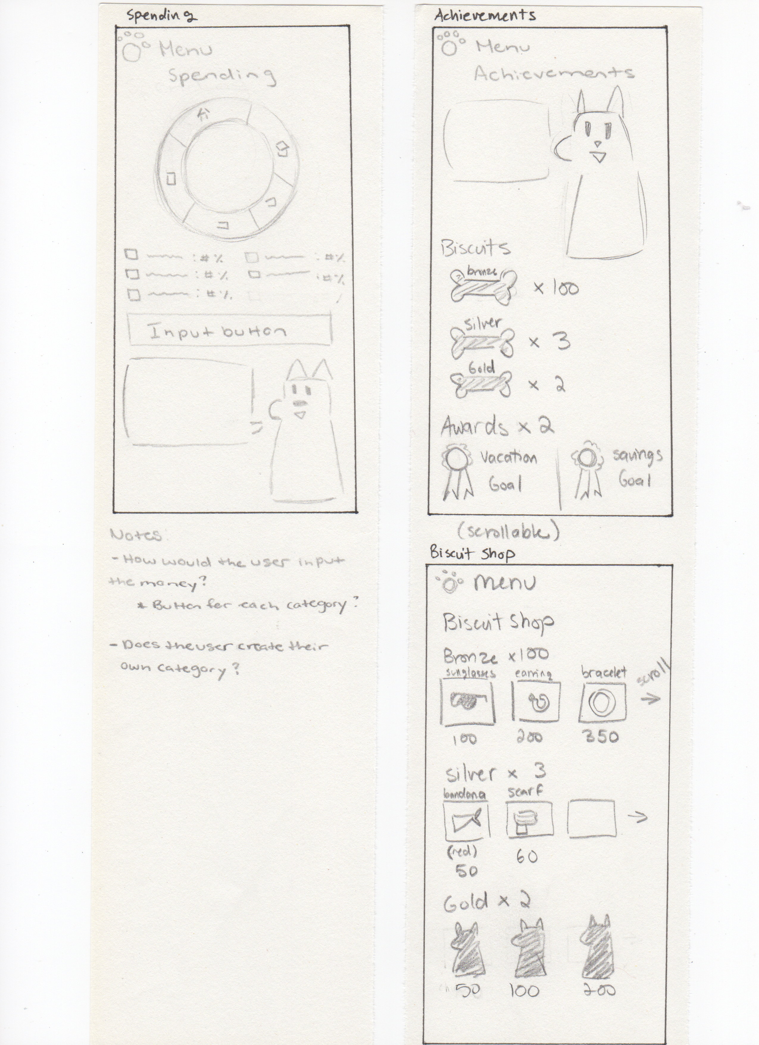
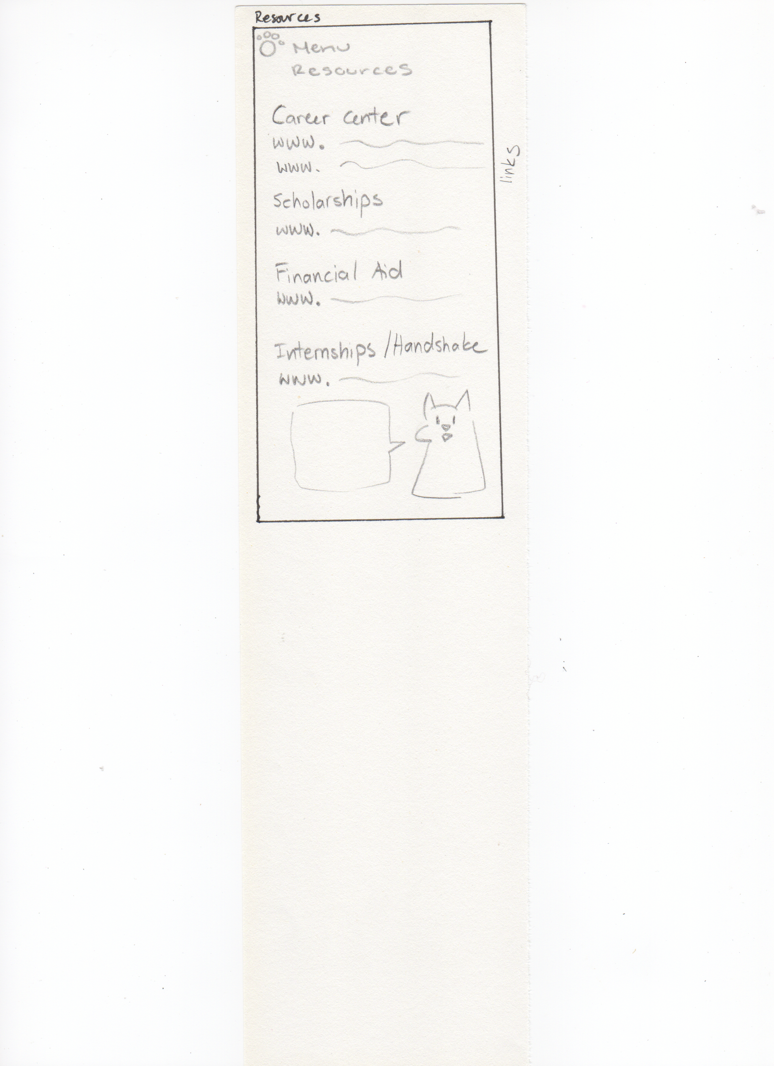
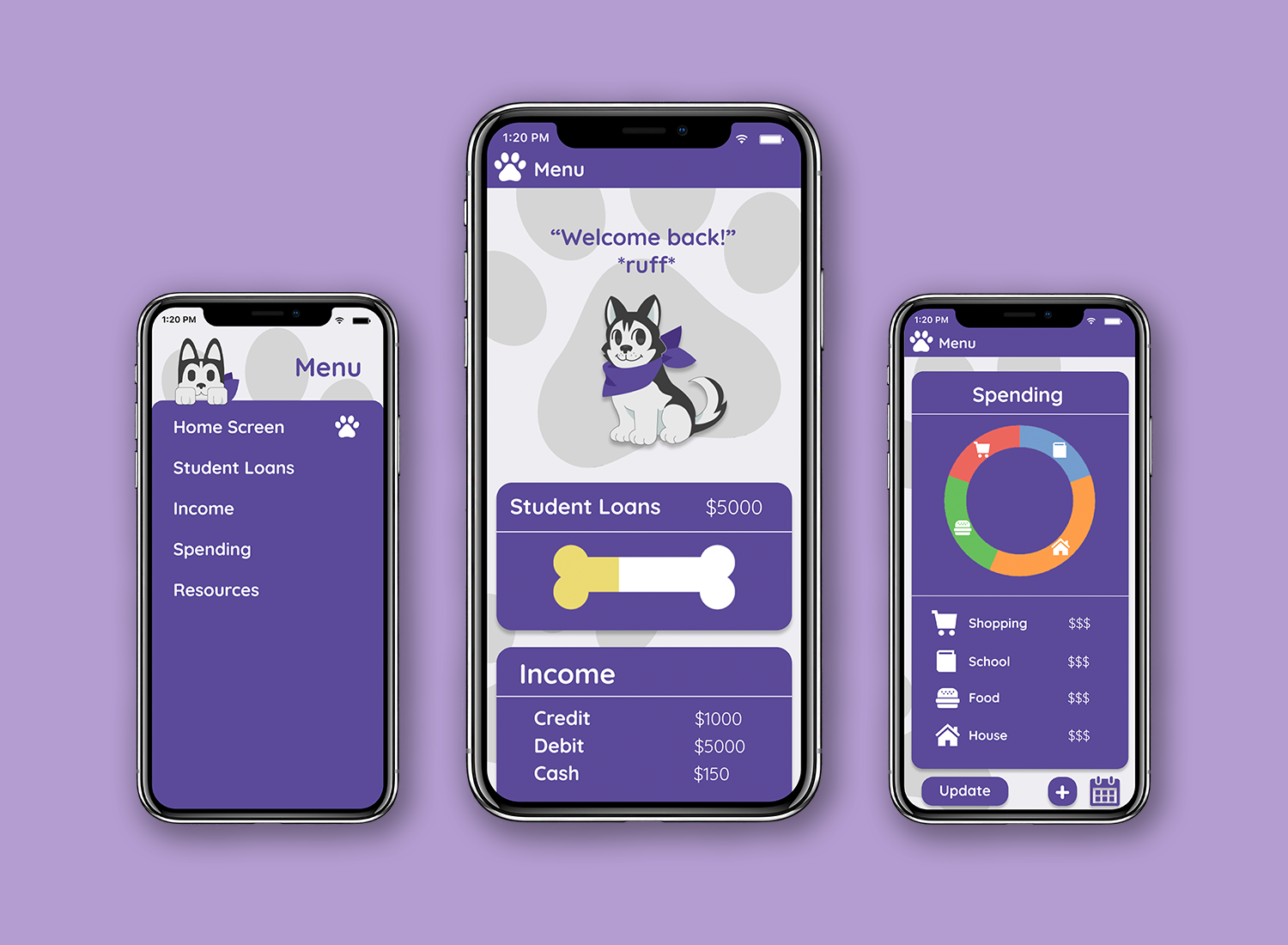
To have the application to stand out from the rest and be appealing to students, an avatar was thought of to be an interactive component. The purpose of the avatar is to be a virtual companion that gives encouragement and reminders to the user. The avatar in specific is a Husky dog for the reason that the breed is the mascot of the University of Washington. Just as how a real dog provides that typical companionship who is always by your side, the Husky dog illustrated in a cartoon style that gives phrases of motivation is perfect fit to help the user feel accompanied on their budgeting journey.
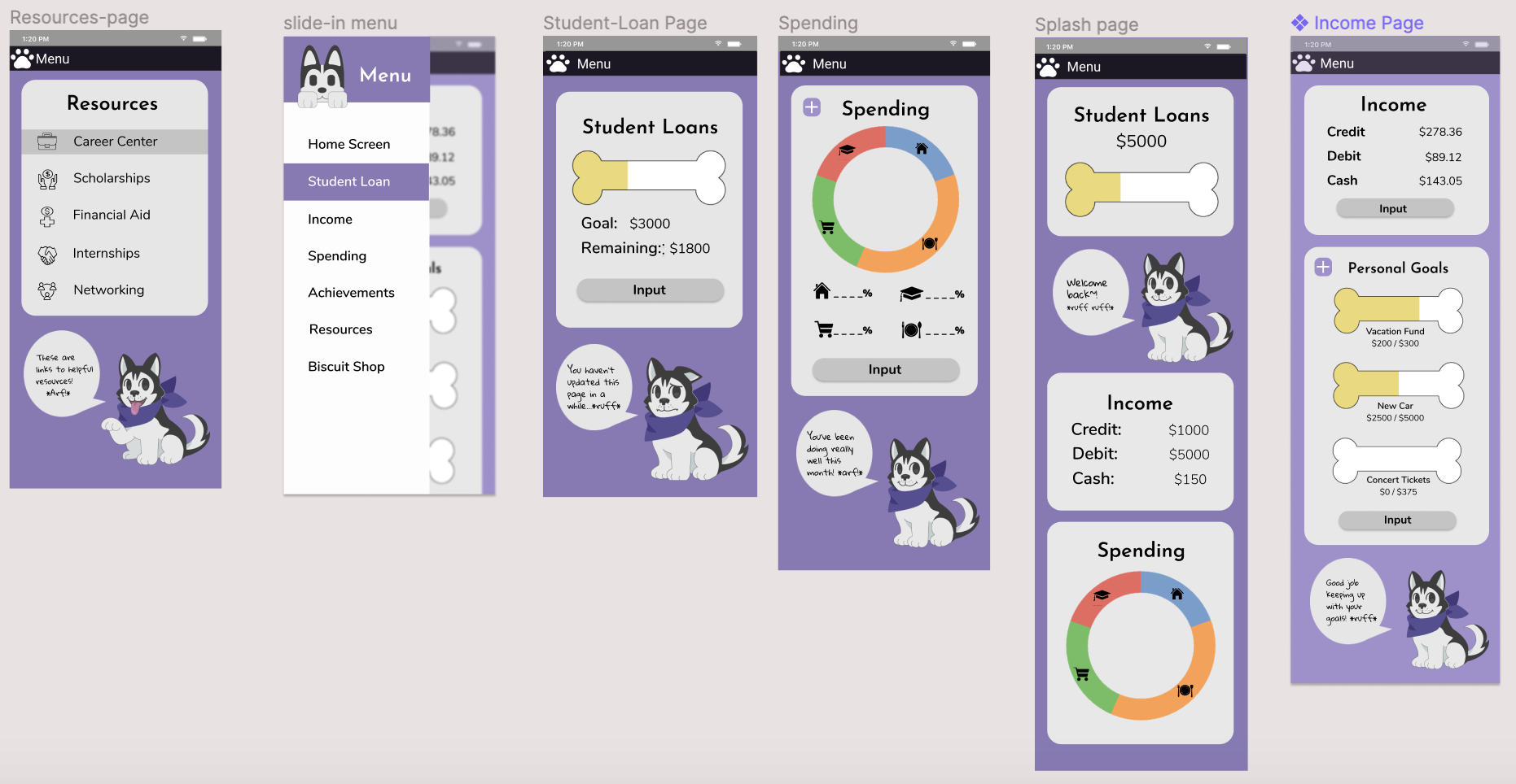
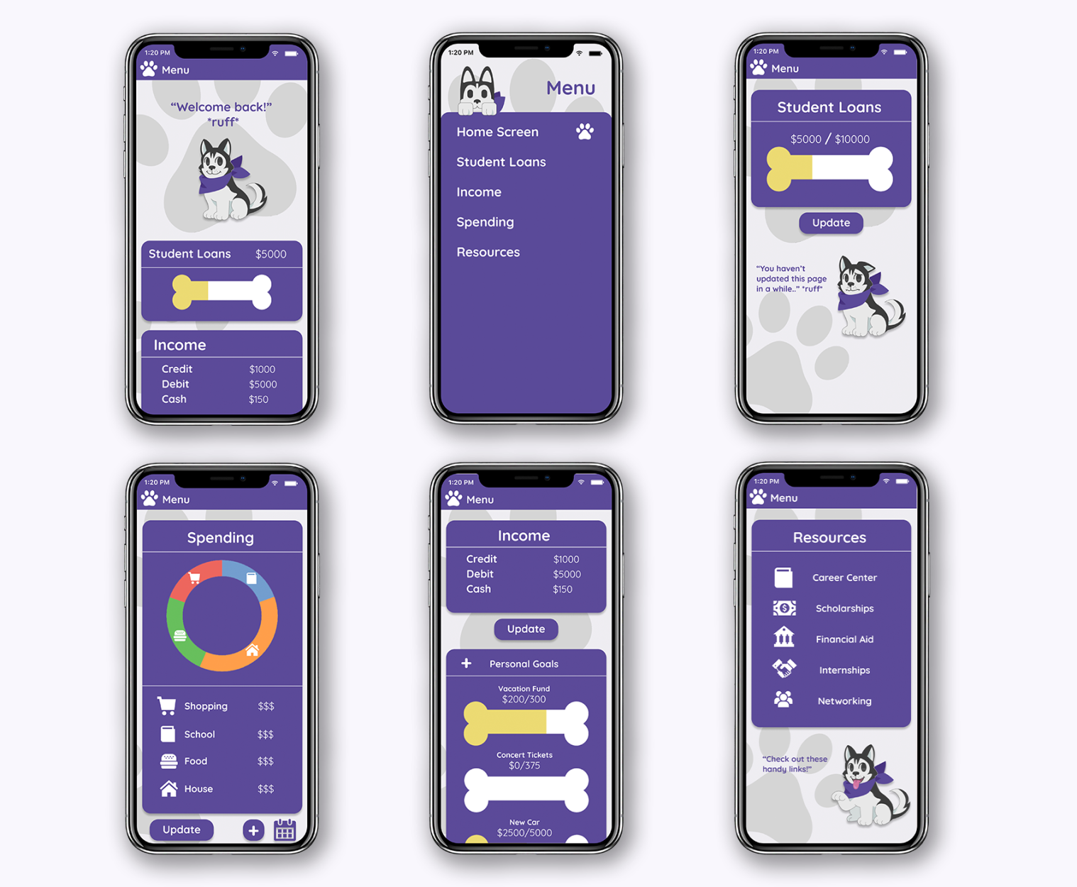
The main changes made from our high-fidelity wireframe was having the background color be more subtle and have the vibrant colors be the accents throughout the application. The information was decided to be separated with rounded squares to avoid having a block of information that could overwhelm the user. Adding the gray paw prints in the background was done to fill in the white space, making the app look playful.
This project was my first project where all of my team members each had a different skill to bring to the project. There was an even split between the coders and the artists, and with this came some challenges in understanding what was most important in the development process and what needed the bulk of our attention. Overcoming these challenges took a bit of time as we had to learn one another's limits.
When the idea was first created, the final goal was to have a functional app to be used by the students of the University of Washington. That is still our goal. The next step is to do a final redesign of the application and pitch the idea to the University.